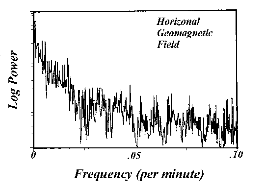
Figure 1. Spectrum of the geomagnetic field.
Copyright © 1999 Kevin T. Kilty, All Rights Reserved
Most of the articles in a column devoted to science projects, like The Amateur Scientist, for example, deal mainly with the construction of equipment. However, science, amateur and otherwise, also entails the analysis of data. Much good amateur science is possible without equipment if the amateur has access to the world wide web and has some capacity to write or use data analysis programs. By data analysis programs I mean in some cases nothing more than a spreadsheet, graphics, or database application, all of which are available in the typical integrated office package.
This note provides a general description of an amateur project in spectral analysis that I have been carrying on periodically for the past decade. Some of the data that I refer to were collected with sophisticated and expensive equipment and placed on the world wide web through the courtesy of some U.S. Federal Agency or a foreign government. In other cases the data were collected with apparatus described in the Amateur Scientist column, or other simple and inexpensive apparatus. The software involved is not available in typical packages for the personal computer. Should anyone wish to engage in similar studies, I will make the software available through my domain name www.kilty.com as an executable task or source code in 'C'. There are many subtleties involved in spectral analysis. Some of these I discuss in an appendix to this letter, but the interested amateur ought to read some explanatory material about spectral analysis. I'm not up to the task of writing a complete tutorial on the subject right now, although I have a skeleton outline ready. Hewlett-Packard had a very good introduction that came with their dynamic signal analyzer, and I may attempt to get permission to reproduce it on-line. Look for these supplementary materials by mid-summer 1999 or so.
The geomagnetic field. The earth's magnetic field is not constant. Both the direction of the field lines and the field intensity change over time periods ranging from hundreds of times per second to once per 600 millenia. There are many observatories around the world that publish magnetometer readings on-line. Figure 1 shows a spectrum calculated from data acquired from the University of Tromso, Norway at http://geo.phys.uit.no/ There is nothing especially interesting about this spectrum except that it displays a characteristic common of geophysical time series; such as river discharge, tree rings, sunspot activity. It exhibits 1/f noise. It is noise that shows a rise in power as frequency becomes lower. One interesting characteristic of 1/f noise sets it apart from what we ordinarily think of as random noise (stationary, gaussian). With a long enough record of random noise, we can decide how probable is a certain data magnitude. With 1/f noise new high and low records are forever being established -- there is no such thing as an average that a person can equate to a "normal level." Where does 1/f noise come from in geophysical data? That is the basis of an award winning study. No one knows for certain.
Figure 1. Spectrum of the geomagnetic field.
The data that went into Figure 1 were collected at a one-minute interval. Had we access to data collected hundreds of times per second, we could detect geomagnetic signals known as Schumann resonances. There is a brief explanation of these at http://www.oulu.fi/~spaceweb/textbook/schumann.html. Briefly stated, the space between the ground surface and the ionosphere is a waveguide for particular components of the noise of lightning strokes, and power systems. How this happens may be difficult to envisage, but the discussion surrounding the acoustic box, below, should make it clear.
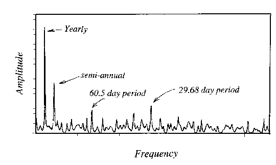
Figure 2. Spectrum of surface pressure as measured at Cheyenne, Wyoming, 1984-1996.
The weather. It is obvious to everyone that the weather varies over a daily cycle and over the course of a year. One might wonder if there are other weather cycles too subtle to readily detect. Figure 2 shows a spectral analysis of surface pressure as recorded at Cheyenne, Wyoming during the period 1984 to 1996. There are several sharp signals in the spectrum. I cannot quote the period of these signals precisely because of the limited resolution of the data, but the most obvious cycle lies between periods of 356 and 374 days. This is the well known annual cycle of surface pressure which results from the changing temperature of the ground surface through the year. Weather stations above 400m elevation have lower pressure during the winter; stations below 400m show the opposite. The next peak occurs near 182 days, or twice per year. It is the first harmonic of the annual cycle; and results from surface temperature not following the changing insolation exactly. The next largest signal occurs at a period near 29.68 days. I will leave it to you readers to decide what it represents; but, once you solve this mystery you may wonder why there is no prominant peak near 14.84 days as well. The only other interesting signal occurs near 60 days. I have no idea what it represents. It may be the sixth harmonic of the anual cycle, but that leaves one to wonder why the other intermediate harmonics are not also present. The large pressure variations that accompany mid-latitude storms do not occur on cycles and contribute only to the noisy background of this spectrum. An enormous amount of daily weather information, including temperature, precipitation, winds, and pressure are available on-line in records of the national climatic data center at http://www.ncdc.noaa.gov/. These pressure data are from Summary of the Day (SOD) archives, which are data set TD-3210.
Tides. The tides are one of the most fascinating series of data to examine. Of course, we know that the moon and sun are the cause of tides, but the shape of a coastline, depth of water, and the orientation of the moon and sun with respect to the earth's axis all impact the exact form the tides assume. The result is that the tides have endless variety. You can pick up tidal gauge data at NOAA at the internet address http://www.opsd.nos.noaa.gov/. One interesting tidal gauge is on Knik Arm near Anchorage, Alaska. The tides have an enormous range on this inlet, and the inlet itself is fairly shallow. Figure 3 shows a spectrum calculated from three months worth of tidal data taken at 1 hour intervals. Over the course of three months the moon has gone around the earth three times. So one component on the spectrum is a peak near 1 cycle per lunar month. The earth rotates once per day beneath the sun and moon so there is a peak near 1 cycle per day. However, that peak is, in fact, two separate peaks; one of which is 1 cycle per solar day, and the other 1 cycle per lunar day. The two days differ by about 45 minutes in length.
The earth and moon both orbit around a common center of mass which causes there to be a twice per day lunar tide; and there is a twice per day solar tide as well. These are clearly visible as the two most predominant peaks in the spectrum. At this point one naively concludes that we have run out of causes for tides, and there ought to be no more peaks in the spectrum. Yet, there are thrice per day components, four times per day, five, six, and so on. Where do these come from?
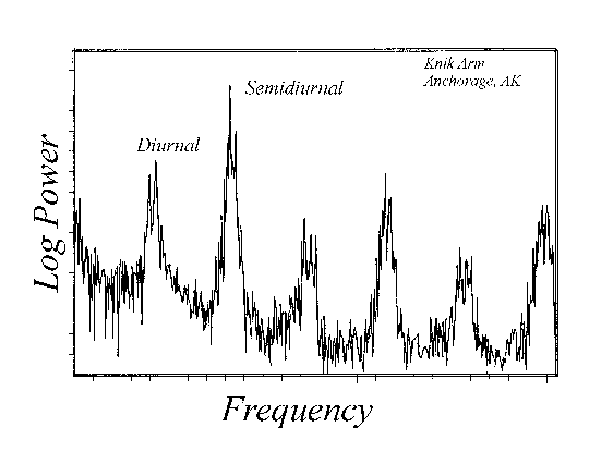
Figure 3. Spectrum of 3 months of hourly tide heights at Knik Arm, Anchorage, Alaska.
When the tide flows into Knik arm it does so quickly. When water flows out again on the ebb tide, it does so slowly. This asymmetry in the ebb and flow produces harmonics of each primary cause. This is an example of the nonlinear behavior of waves in shallow water.
Seismicity. At the University of Northern Colorado one semester, Dr. Wm. Nesse, the Chairman of the Earth Sciences Department, had his students build a version of the horizontal motion seismometer described in The Amateur Scientist. The instrumentation was updated by the department's technician. Large earthquakes were infrequent, but there were still many things to examine. During November, 1993 particularly large storms were pounding the coast of the Pacific Northwest. The large waves in such storms place a varying load on the continental shelf. This, in turn, produces seismic waves. When the ocean waves have a period of 12-14 seconds, they produce seismic waves of half the period. Seismic waves of 7 second period propagate easily in a duct within the mantle and appear on seismographs in mid-continent. In effect, these waves are the seismic equivalent of the Schumann resonance. Figure 4 shows the spectrum from such a seismogram. Note that there appears to be a second, smaller peak hidden in the shadows of the main one. This could be the contribution of a second storm elsewhere in the Pacific basin.
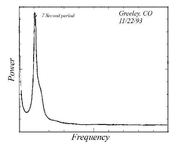
Figure 4. Spectrum of seismometer output at Greeley, Colorado.
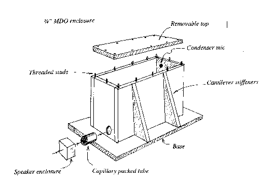
Figure 5. Construction of a box to illustrate normal modes.
The acoustic box.Two years ago I built a device for a college that is intended to exhibit the normal modes of a structure. I once saw a similar device described in The American Journal of Physics, but it was built of slate, expensive, and inconveniently massive. Figure 5 shows my version. It is a box with walls made very rigid using cantilever columns. In one corner of the box is a small hole in which I placed a condenser mic. In the opposite corner is a hole, in which I mounted a tube, packed with small capillaries, which leads to a speaker. One way to use the device is to drive the speaker with a signal generator. At certain frequencies, which match the normal frequencies of the enclosure, the microphone records a huge response. This is a resonance. A more instructive way to use the device is as follows. I attach an FM radio to the speaker and tune the radio to some empty place on the dial. The speaker is now making a hissing sound, or in other words, it is putting white noise into the box. I now take a short sample of the sound from the mic output. I calculate the spectrum. Figure 6 is an example of the output. Amazingly it is no longer white noise. There are peaks in it, and each peak corresponds to some natural mode of vibration of the box. For example, I have marked two of the modes. The first is the (2,0,0) mode which consists of two wavelengths in the long dimension of the box. The second is the (1,1,0) mode which has components in the long and intermediate dimensions. It is a wave that appears to circulate horizontally around the box, and is called a "tangential mode."
We could do the same thing with a large structure like a bridge. Attach a sensor of some kind like a strain gauge to it, let the wind and traffic buffet the bridge and record the output of the gauge. The spectrum would show the various modes of oscillation of the bridge. The next example shows something like this.
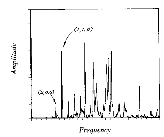
Figure 6. Standing wave spectrum in the box with an input of white noise.
The train. In the small town that I once lived in, empty coal trains would rattle through several times a night on their way to the coal fields of Wyoming. They made a horrible sound that rattled the walls and windows. It seemed especially bad on cold nights. I set up a microphone to record the sound. Figure 7 shows 4 seconds worth of time series data. How in the world could someone analyze such a mess and make sense of it?
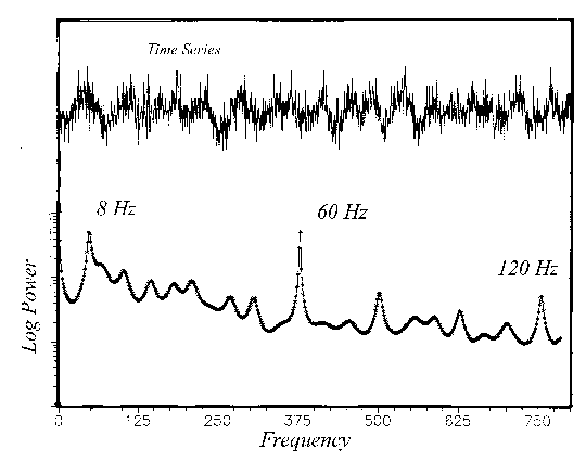
Figure 7. Spectrum of 4 seconds of railroad noise at Lagrange, Wyoming.
Figure 7 shows the spectrum. There are peaks near 60Hz and 120Hz, which show only that my microphone cable coupled to the power system in the house. However, there is a more interesting peak at 8Hz which is below the sense of hearing, but which still stimulates the senses. Subaural vibrations like this can be very irritating and may even make some people nauseous. Where do such sounds come from? We might first suspect the sets of wheels on the train smacking joints in the rails. However, a train would have to move very fast for this to be the cause because the wheel sets are perhaps 40 feet apart on each car and 20 feet apart car to car. For these to hit 8 times per second would have the train moving 120-240 mph! It is possible that the cars themselves vibrate (flex) as they hit the joints and the 8 times per second is a normal vibration mode of the cars. A better possibility is that the sound of wheels hitting the joints is reflected by a layer in the air that is 60 feet above the ground. The 8 times per second sound is the reverberation. This provides an explanation of why the sound was so awful on cold nights (there is likely to be an inversion on cold nights.) Thus, the sound of a train gives us information about construction of the rail cars or about meteorology, we aren't sure which right now!
I have many other examples of spectral analysis, such as the sounds of water flowing in caves as recorded at the ground surface, or the sound made by tapping a spoon on a cup of coffee or hot chocolate in which foam is clearing, and the sounds of expensive and cheap violins playing America the Beautiful.
A spectrum is a collection of simple components that are added together to produce a complex signal. When we use the term spectrum we typically mean sine and cosine functions as components, but there are other possibilities. One new, and interesting example are the components called "wavelets."
The prototype spectrum is the collection of various pure colors of light that go into making white light, and which a prism or grating will separate. In all of the cases that I discussed in this note the signal is a time series. They are numerical values of some quantity collected at equally spaced time intervals.
Strictly speaking, a true spectrum exists only for time series that are statistically the same over all time intervals, and which have existed for all time. Since neither of these restrictions obtain in practice, we can do no better than estimate the true spectrum. How well we estimate depends on three things:
Aliasing is a difficult concept to grasp, but it is essential to understanding spectral analysis. All of the data that we work with consists of numbers taken at discrete instants of time. Generally the time interval is a constant. However, the phenomenon that we are observing has a value at all intermediate times. It is obvious that if we collect data too infrequently, we cannot detect rapid variations in between the samples. But, the situation is actually worse than this. If we sample too slowly we risk confusing very fast variations with very slow ones. A simple example is easy to come by. Suppose that the signal we sample is a sine function with a period of 1 second. Suppose that we sample this each second and estimate the spectrum. We think that the spectrum would show a single component with a period of one second. But we are sampling so slowly that each number is the same, and instead of detecting a variation, we estimate that the data are constant in time.
This confusion in assigning frequency is called "aliasing." To avoid it we have to sample frequently enough that no significant components are missed; or we have to electronically filter the data prior to taking samples. The highest possible frequency we can assign without ambiguity is one cycle for each two samples, and is called the Nyquist frequency.
The effect of aliasing is generally not easy to describe, but almost everyone is familiar with two examples. Phantom patterns in an image can result from aliasing. Moire patterns, for example, result from aliasing a periodic spatial image. Another example is a strobe light which samples a rotating object so slowly that it aliases the motion and makes it appear stationary. Thus, sometimes aliasing is useful.
We collect data for only a brief span of time. If our data are varying extremely slowly, we cannot expect to detect this variation accurately in a brief span of data. Therefore, the span of our data certainly sets a limit to the slowest signal we can detect. Once again, the situation is actually a little worse. The span of data that we measure determines the best resolution we can attain between adjacent components of a spectrum.
Amateur astronomers will recognize an analogy with telescopes. Having a limited aperture on a telescope limits resolution of closely spaced objects. In an analogous manner signal time span limits the resolution of closely spaced components of the spectrum.
The analogy with optics goes further. In order to improve the resolution of a small aperture, a lense can be darkened progressively from its center to its edge. The resulting apodized objective will provide better resolution of closely spaced objects at the expense of a darker image. In time series, likewise, we may taper data using a windows such as the Tukey window (cosine taper), and the Parzen window (cubic polynomial taper). Applying these windows improves resolution, but it does so at the expense of discounting information, especially at the extremes of our data.
There are many ways of estimating spectra, but a common way is to use a Fast Fourier Transform (FFT). An FFT requires evenly spaced data. Sometimes data are evenly spaced when they are collected. However, if they are not, we have to interpolate the data. This links a spectral estimate with the performance of an interpolating algorithm.
An FFT has a further effect. If we have samples of data over a particular time span, the FFT algorithm implicitly assumes that the data are periodic and have a period equal to this same time span. For example, if I extract a segment of tide data that is three months in length, the fourier transform assumes that the tides just repeat in this same pattern every three months. Obviously this is not so, and it leads to some error in estimating the true spectrum. One might conclude that an FFT is like a Fourier series that has been truncated at the Nyquist frequency. However, this characteristic of the FFT to make all signals periodic makes it behave as a trigonometric interpolator. It produces a spectrum that is an aliased Fourier series.
An FFT also errs in estimating the spectrum in another way. If the beginning and end of the sampled signal are not equal, the time series is discontinuous, and the FFT will calculate too much power in the high frequency part of the signal. The same thing happens if any derivatives of the data are discontinous.
I calculated the spectra of tides and the acoustic box using the FFT.
Another way to estimate a spectrum is as follows. We imagine that we can pass our series of data through a device designed to figure out what information there is in the data and remove it. What comes out of the box, then, is a series of random numbers completely devoid of information. Such a device is the inverse of the acoustic box! We put in a signal and what comes out is white noise.
The only device that could do this is one that acts like the inverse of the spectrum. So if we know the operation of the device we also know the spectrum.
There is a computer algorithm, due to John Burg, which can figure out how to remove all the information from a signal. Once the algorithm figure how to do this, we can use its design to obtain the spectrum of the data. One advantage of this method is its ability to precisely locate peaks in the spectrum. The spectra of pressure cycles, the seismic signal, and the train noise in this letter all result from the Burg algorithm.
Very truly yours,
Kevin T. Kilty, Ph.D.
kevin@kilty.com